Finance and Accounting
Data visualisation techniques for effective enterprise reporting
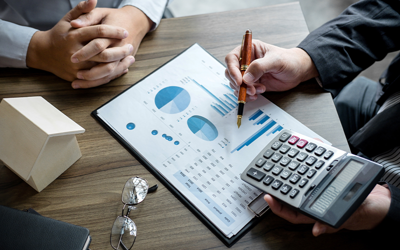
The complexities of big data coming from multiple online, offline, internal, and external sources are raising the demand for business analytics and data expertise. This not only synthesises the data and makes it easy to understand by all but also helps the senior management make data-driven decisions. It is important to represent the data in a way that is simple and visual.
This article explains the different data visualisation techniques.
What is data visualisation?
Data visualisation is the process of representing graphical information through numerous techniques such as heat maps, charts, box plots, and more. This makes it easy for stakeholders to easily understand and analyse the data and derive actionable insights. With big data arriving in greater variety, velocity, and volume, data visualisation simplifies it into meaningful information.
Factors that influence data visualisation choices
Before we dive into the data visualisation techniques, let us understand the factors that influence your choices.
-
Audience
Adjust the data representation and visualisation according to the needs of the audience. For example, a visualisation for scientific research can go beyond 3 simple bar graphs. -
Content
Your choice of visualisation technique will depend on the nature of the data. Use a bar graph for comparative analysis and a line chart to show time-series metrics. -
Context
Use different visual elements to make parts of the graph stand out. For example, use the brightest colour to show the year with the highest profits. Else, use different shades or textures in a bar graph to visually differentiate and set the context. -
Dynamics
This depends on the frequency at which the data changes. For example, financial results are quarterly, half-yearly, and yearly. Time-dependent data is constantly changing. Each of these elements requires a different representation method. -
Purpose
The data representation should be simple and customisable dashboards that have several tools for visual data analytics with filters, formatting options, and comparison methods.
Benefits of data visualisation
The primary benefit of visual data representation is to make it stand out and be easy to understand. One can easily see the trend on a line chart rather than in a massive spreadsheet with numbers. Some of the benefits of data visualisation are –
- Better way to present the data.
- Use it for the data mining process.
- Cleanse the data by identifying incorrect and missing numbers.
- Know which variables to include and exclude.
- Reduce the amount of data by combining the categories.
Top data visualisation techniques
The type of data visualisation technique you use depends on the factors we discussed above. Here are some of the techniques to choose from –
Box plots
A box chart displays the data on a five-number summary. It is great if you want to determine how much your data is skewed or tightly grouped. Box charts take up less space when you are working with multiple data sets and groups. The typical meaning and distribution of a box plot is –
Minimum value à First quartile à Median value à Third quartile à Maximum value
Heat maps
A heat map uses colours to differentiate between different groups of data as a visualisation technique. For example, a heat map of a city may indicate the most densely populated areas in red colour, the sparsely populated areas in green colour, and different shades in between to show variation in population densities.
Charts
-
Pie charts
Pie charts are circular charts with individual slices in different colours representing the categories. The area of each slice or the length of each arc represents the quantity or value of that category. -
Bar graphs
The horizontal or vertical bars of different colours and lengths/heights represent the values in a bar graph. While the colours represent different categories, the length/height of the bar represents the value. -
Histograms
Histograms represent data distribution over a defined period at regular intervals. This helps identify areas with gaps and those with high concentration. -
Gantt charts
Gantt charts are good for showing the progression of a task or a project which is why they are very useful for project managers. The tasks are on the vertical axis, and the time allotment on the horizontal axis represents the duration of each task. -
Waterfall chart
It tracks and displays a single value that changes over time depending on different factors. This shows how the value has increased or declined over a given period.
Treemaps
Treemaps represent a hierarchy of data, with the parent data engulfing or encircling the child elements. The size and colour of a shape are proportional to the value of the data. By making efficient use of space, treemaps can display thousands of elements on a single screen.
Word cloud/Network diagram
Semi-structured and unstructured data require new and innovative visualisation methods. A word cloud with the font size represents the frequency of that word in each text. Network diagrams present relationships as nodes and ties and may be helpful in mapping product sales across geographies.
For organisations on the digital transformation journey, agility is key in responding to a rapidly changing technology and business landscape. Now more than ever, it is crucial to deliver and exceed on organisational expectations with a robust digital mindset backed by innovation. Enabling businesses to sense, learn, respond, and evolve like a living organism, will be imperative for business excellence going forward. A comprehensive, yet modular suite of services is doing exactly that. Equipping organisations with intuitive decision-making automatically at scale, actionable insights based on real-time solutions, anytime/anywhere experience, and in-depth data visibility across functions leading to hyper-productivity, Live Enterprise is building connected organisations that are innovating collaboratively for the future.
How can Infosys BPM help?
The data visualisation techniques we discussed above are helpful in reporting, analysis, and planning in finance. It helps avoid inconsistent reporting, duplicate data from multiple sources, and lengthy planning cycles.
Read more about enterprise reporting services in finance at Infosys BPM.