DIGITAL INTERACTIVE SERVICES
How to create a killer infographic
Yes, a picture can say a thousand words. And that is exactly where infographics come in. Infographics are an easy way to highlight the salient points of an extensive or even technical subject by using a mix of graphics and text. It can be prepared in different forms such as static, interactive, or video. It is widely adopted by organisations, both as standalone infographics or as dashboards comprising multiple infographics, as they can convey key takeaways from detailed information at one glance to their audience.
When should you use an infographic?
Clearly, infographics are not suitable for content that is abstract, such as essays, poems, etc. It is best suited for content that fits the following criteria:
- Detailed facts and data points
- Steps to complete a certain process
- Summary of information from different ranges, for example, data pertaining to multiple time periods
Factors to consider while designing an infographic
Once the content is finalised, we get to the matter of designing an ideal infographic. There are several things to be kept in mind while attempting to do so.
Understand the topic before preparing an infographic by going through the content thoroughly. Make a note of all information that is presented as data figures – these can be represented as visuals in the infographic during the design stage. Categorise information based on whether it makes more impact as a text or a visual - you would want to create a lasting impression through an impactful data-driven infographic.
Choose a layout for your design. This decision will be based on where you want to share the final design. A commonly used layout is the tall layout. For most social media sites, a layout with a square ratio (1:1) is preferred, but Pinterest allows tall images. For printing purposes, the layout should be in standard print sizes or custom sizes as per the printing company’s capabilities.
Choose an appropriate heading for your infographic; it is the first thing that catches your audience’s eye. Place it at a prominent position with content that is hooking, while at the same time short and easy to understand.
Tools to create infographics
Several tools can be used to create an infographic. The most recommended tool is Adobe Illustrator because it provides more options for editing vector graphics. Alternatively, Photoshop, Adobe XD, Figma, or PowerPoint can be used to create infographics.
People who are not familiar with designing can use web-based tools such as Canva, Adobe Express, Visme, or Piktochart. These tools provide readymade templates which can be modified. They also allow users to create a new infographic from scratch, by introducing various new elements.
Balancing visuals and information
Infographics are most effective when they strike a good balance between rich visuals and pertinent information. It can be tricky to achieve this balance even for experienced designers. Let’s look at some best practices to help us achieve this balance.
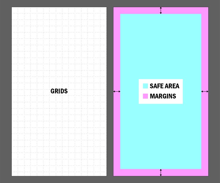
- Define boundaries by using margins
- Choose your fonts wisely
- Graphs and charts
- Make your design icon-ic
- Make it lively with illustrations
- What colour do you choose?
- Branding
Create margins around the blank layout before placing text and graphics. Margins define a safe area within which content can be placed and maintain a clean representation of information. Graphics and text should be placed in such a way that there is enough space around them. This keeps the layout from becoming too crowded.
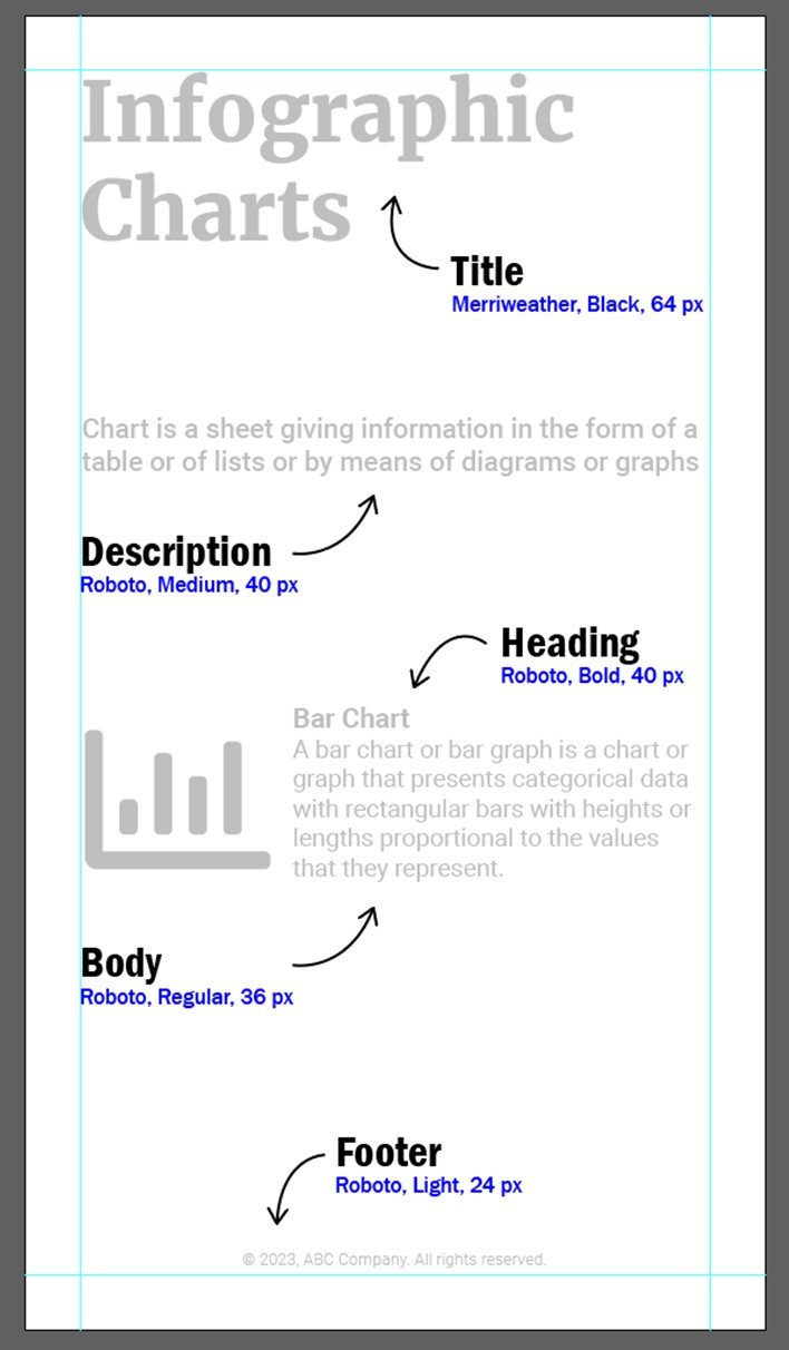
Select no more than two fonts – that’s all you need. You can choose a bold and striking font for headings such as Merriweather, and a neutral and more versatile font for the body text. You can opt for a font family which has different variations of the same font, e.g., the Roboto font family includes styles like Regular, Medium, Bold, Black, etc.
Understanding the usage and application of varied graphs or charts is essential for creating infographics. Donut charts, histograms, and line charts are commonly used in infographics.
Icons are simple yet powerful graphic elements that can be used to enhance infographics. Icons come in diverse forms like colour, solid, line, 3D, and isometric. Ensure that the icons used throughout the layout follow a uniform style. You can make use of icon libraries from FontAwesome and Material Icons from Google.
Illustrations, when used correctly, can help elevate your design. Similar to icons, there are multiple styles of illustrations, so when you apply illustrations, make sure that you adhere to the same style throughout.
Colours speak a silent language and choosing the right colours can elevate your design from average to professional. Colours should be applied across the objects in your layout. Start by choosing a colour palette that has 2 primary colours and 3-4 accent colours.
Finally, once the layout is complete, add the company’s branding at the bottom of the layout. This can be your company’s logo, tagline, hashtags, etc. You need to place it in such a manner that calls attention to your company.
And there you have it – the perfect infographic, that leverages the power of colour theory, accurate graphs/charts, arresting designs, and illustrations to drive the point that your brand is making deep into the minds of the target customers. It is simply a sure-shot way to jack up your branding game!