BPM Analytics
The importance and applications of data visualisation
Detailed, in-depth data is a valuable organisational asset. Thorough analyses of historical data about customers, processes, sales, profits, market reach, or any facets of the organisation can yield valuable industry insights and help predict future trends. But making sense of massive amounts of data isn’t a straightforward process unless it is presented in a direct, visual medium to quickly identify patterns and trends vital to making key business decisions. That is where data analysis and visualisation come in.
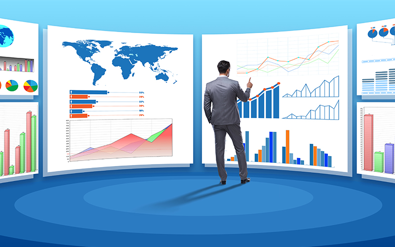
In simple terms, data visualisation is a graphical representation of information designed to highlight patterns, trends, anomalies, or exceptions. These visual representations of data can be in the form of bar graphs, histograms, pie charts, scatter diagrams, or pictographs and can incorporate a variety of colours and shapes to provide a better understanding of the data. Data visualisation converts masses of raw textual and numerical data into a lucid format to be analysed and acted upon. The following points highlight how incorporating data visualisation into data analysis processes can help you better comprehend and apply your business data.
Discover trends:
The primary advantage of data visualisation in data analysis is that it makes identifying patterns and trends easier. While it may take hours of poring over extensive data tables to yield any actionable insights, having the same information laid out visually makes it much easier to comprehend it at a glance.Get a new perspective:
An all-inclusive visual representation of data presents the viewer with the bigger picture in an easily digestible format. This can provide newer perspectives on how specific data references relate to various aspects of the business. Such insights are difficult to achieve by reviewing raw data.Better understand data processes:
A series of data visualisations can effectively demonstrate data processes to a level not achievable by looking at data tables. A series of charts can be used to create a data story that viewers can easily understand and absorb for an in-depth understanding of data processes, presented in bite-sized chunks.Fire up the imagination:
viewing dry data tables is hardly a way to get the creative juices flowing. Humans are primarily visual beings and can much better absorb and examine data presented in a visual format. Data visualisation that is attractively designed is a much better way to fire up the viewers’ imaginations for a more comprehensive understanding of data.Understand the data story:
Data visualisation narrates a story when presenting the facts in a way that a data table cannot. When presented accurately and efficiently, data visualisation should be able to tell a story in a structured manner and lead viewers to an inevitable conclusion. Understanding the data story is essential to making the right business decisions at the right time to grow the organisation, boost profits, and reduce expenses.Accurately contextualise data:
It is challenging to accurately understand the context of data just by looking at numbers in a table. A visual medium immediately adds context to raw data, making it easy to understand concerned numbers and statistics, which is invaluable when making data-based business decisions.Save time:
Examining and analysing data charts is a long and arduous process. It’s much easier and faster to make conclusions based on the data when presented visually, with all the relevant information condensed together. Absorbing and understanding data faster implies quicker decision-making, and timely decisions ensure a healthy business.Make data attractive:
Raw data may be packed with information, but it certainly isn’t pretty to look at. Data visualisation allows this information to be presented in an attractive manner that piques interest more than monotonous tables and charts. When data is presented in a way that is pleasing to the eye, viewers naturally tend to spend more time thoroughly examining it, leading to valuable business insights.
For organisations on the digital transformation journey, agility is key in responding to a rapidly changing technology and business landscape. Now more than ever, it is crucial to deliver and exceed organisational expectations with a robust digital mindset backed by innovation. Enabling businesses to sense, learn, respond, and evolve like living organisms, will be imperative for business excellence. A comprehensive yet modular suite of services is doing precisely that. Equipping organisations with intuitive decision-making automatically at scale, actionable insights based on real-time solutions, anytime/anywhere experience, and in-depth data visibility across functions leading to hyper-productivity, Live Enterprise is building connected organisations that are innovating collaboratively for the future.
How can Infosys BPM help?
As listed above, there are several advantages of data visualisation in data science. Visualising data helps make the most of your analytical processes, and swiftly identify problem areas. It is an ideal way to present complicated, multi-layered information to team members who are not skilled at reviewing and analysing data, so you don’t have to be a data scientist to get the best out of your data. Infosys BPM offers extensive marketing and customer analytics services to help you develop newer and better ways to understand and act on your business data. Contact us to find out which tools suit your organisation the best.


